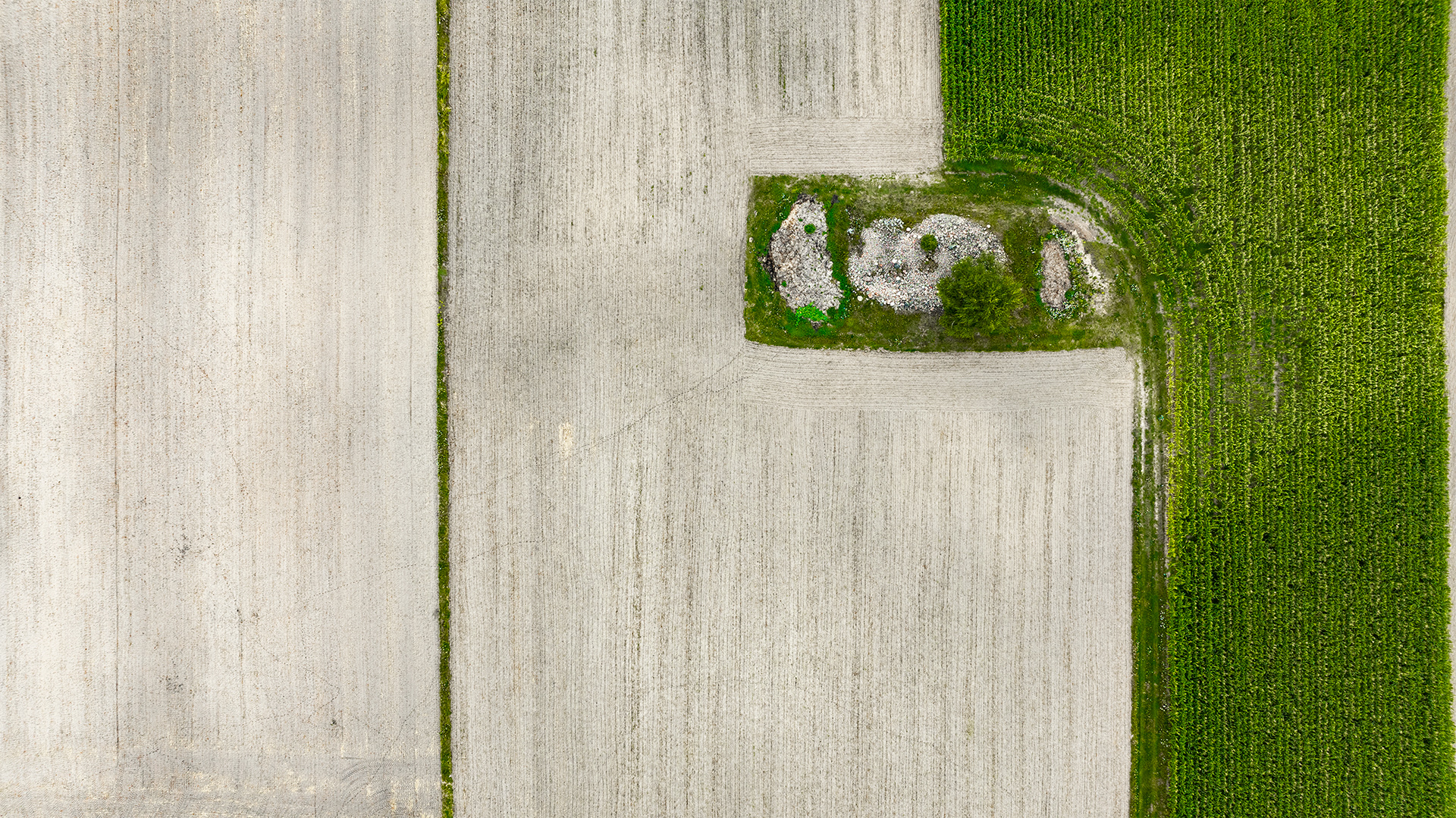
This is a subtle juxtaposition of two seemingly calm colors that combine to create a balanced and harmonious composition. The light-coloured, less saturated ecru serves as a neutral background that softens or intensifies the accompanying green. Although the green is visually more expressive, the presence of ecru gives it a natural and peaceful context reminiscent of nature – plants on sand, earth.
Both colors have a calming and relaxing effect. The character of the green in this composition changes depending on the incidence of light – it can be cooler or warmer, more restrained or more present. This creates a dynamic harmony in which the neutrality of ecru allows the viewer to experience the subtle nuances of green without dominating it.
The painting is an example of color balance, in which the simplicity and naturalness of the form emphasises the psychophysiological effect of the colors on the viewer's perception and well-being.
2024, photography, limited edition of 8, pigment print on the Fine Art paper, 1000x586 mm (945x531 mm without borders)